
Page 84 - Standing Display
P. 84
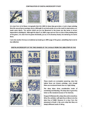
CONTINUATION OF DIGITAL MICROSCOPY STUDY


               It is clear from all of these micrographs that this 1899 1A deep blue generates a much crisper printing

               than the unused green postage stamp. Although the printed words can just be read the impressions are
               much  more  blurry.  The  central  shield  can  just     be  discerned  in  the  green  but  the  horse  is  almost
               impossible to distinguish. Although the blue is an 1899 usage and we have no idea of the printing date

               of the green, it is clear that the green ink bleeds, just as in the Downey Heads, the red being the worst
               there.

               I can only resolve this issue completely by studying an 1899 usage of the green, something that is not in

               my collection.

                 DIGITAL MICROSCOPY OF THE TWO SHADES OF THE 1A BLUE FROM THE 1896 STRIP OF FIVE


                                                                These  results  are  somewhat  surprising,  since  the
                                                               lighter  blues  are  cleaner  printings,  even  though
                                                               there are occasional breaks due to a light inking.
                                                               The  deep  blues  show  considerable  levels  of
                                                               overinking and bleeding. The deep blue is generally

                                                               taken as the standard because of its intensity.
                                                                Koeppel & Manners list a deep blue and a slate blue.
                                                               What the exhibitor calls light blue is likely to be the

                                                               slate  blue  of  K&M.  However  it  is  clear  from  the
                                                               placement of both in the same strip that they are
                                                               simply different levels of inking.
                                                                                                                   1